12 Elements of A High-Converting Website For Real Estate Investors
Your website visitors are skeptical. They're trying to figure out if you can be trusted.
Here's what they're thinking:
- Can you solve my unique problem?
- Have you helped people like me before?
- Can you be trusted?
- What's it gonna cost (Time/Money)?
- Can I easily find what I'm looking for?
Your website must contain the elements that quiet these objections and lead the prospect to a qualified sales call.
All 12 elements covered in this post are covered in detail in the short video below as well.
12 Elements Of A High-Converting Website For Real Estate Investors:
1. Market Callout (AKA “The Dog-Whistle Callout”)
A dog whistle makes a sound that only a dog can hear. Your visitors to your website must feel like they’re in the right place. Make sure to call out to them directly.
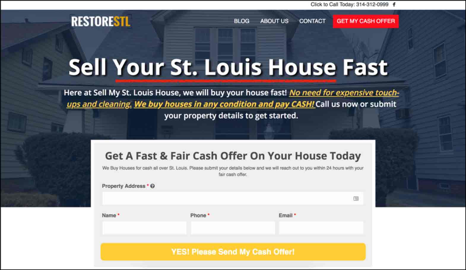
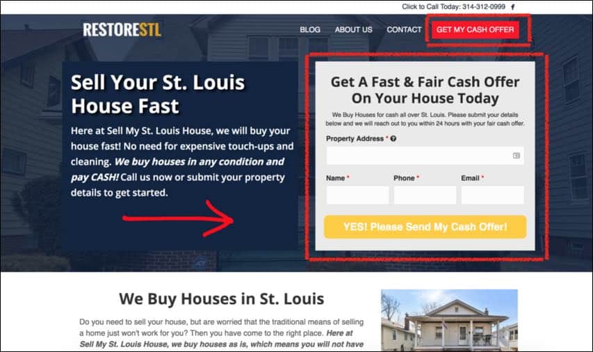
You can see below that St. Louis Home Owners are being called out directly. If someone owns a home in St. Louis that they are needing/wanting to sell fast, then they know they’re in the right place!
Specificity sells. The more specific you can be with your messaging, the higher your conversion rate will be.
If you know you're targeting probate leads in St. Louis, then your headline should read something like this: Did You Inherit A House In St. Louis That You Need To Sell Fast?
Objections this element overcomes:
- Can you solve my unique problem?
2. Crystal Clear Message/Offer
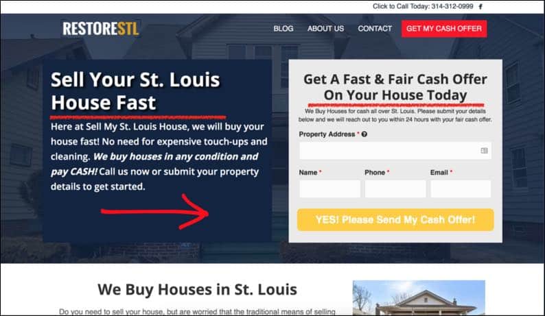
If you are focusing on one target audience (Ex: Sellers, Buyers, Renters, etc.) then it is important to have a single message, that speaks directly to them. As you can see below, the goal of this website is to make cash offers to distressed sellers.
The mistake that many investors make, is that they go out to a broad audience, with a broad message. They try to be everything, to everybody, and in doing so, their message flops.
Objections this element overcomes:
- Can you solve my unique problem?
3. Broad Message to Segmentation
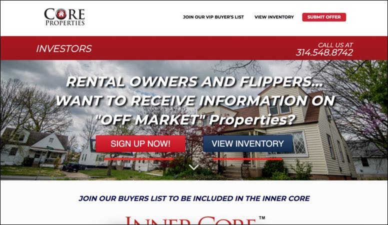
Now, if the homepage of your website is addressing a broader audience, for example, all cash buyers in St. Louis, it’s extremely important to have clear navigations.
You can see below that we are pushing site visitors down 1 of 2 paths, depending on their needs.
Objection this element overcomes:
- Can I easily find what I'm looking for?
4. Compelling Headline
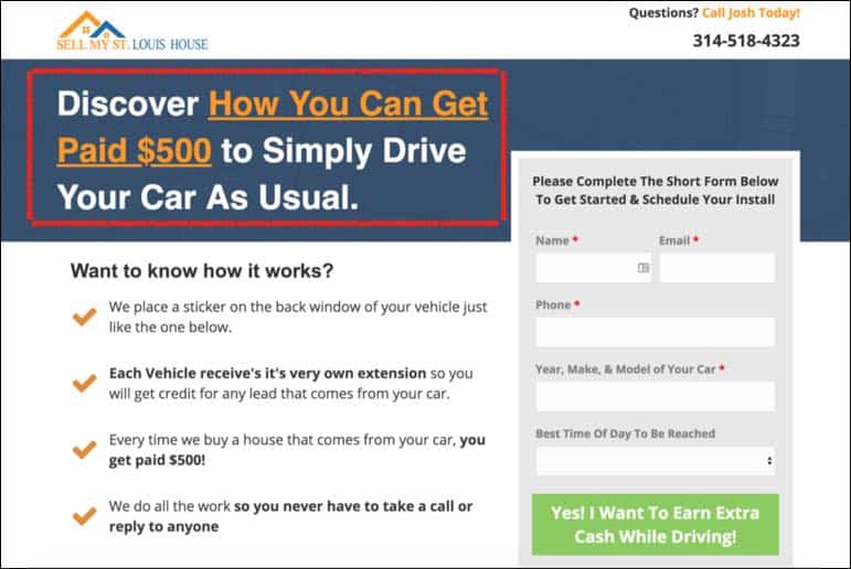
Craft a clear, benefit-driven headline that immediately grabs the attention of your site visitor and compels them to stick around just a little longer to learn more.
The chances of you capturing their contact information will dramatically increase.
Objections this element overcomes:
- Can you solve my unique problem?
5. Call-To-Action (CTA) Above The Fold
Most visitors will never scroll below the fold. Be sure to include your call-to-action above the fold so you can ensure that your website visitors see your offer.
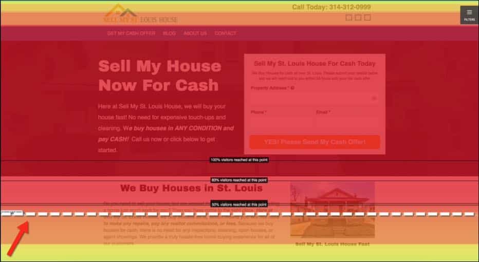
The image below is showing a heat map of the scroll depth on a website that we manage.
It’s a little hard to read, but only 50% of visitors to this website ever scroll down to read the rest of the page.
If the CTA on this page was below the fold (the dotted white line) then half of the website visitors would never have seen it.
Objection this element overcomes:
- Can you solve my unique problem?
- Can I easily find what I'm looking for?
6. Value Driven Bullet Points
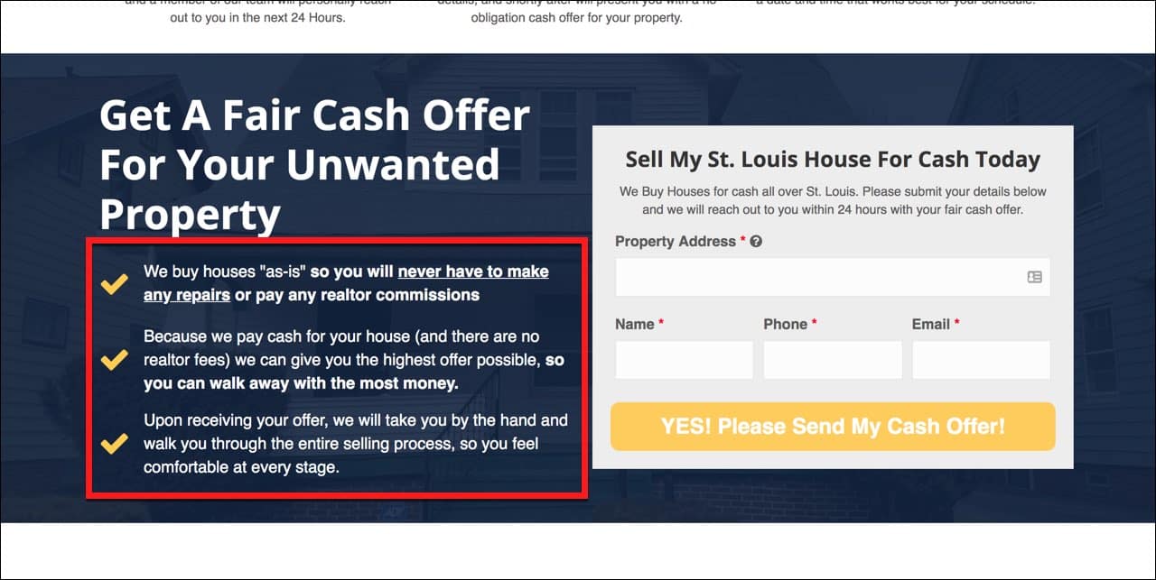
This is where you start to talk about the benefits of your service: buying as is, all cash offers, no inspections, 7-day close, etc. These are all benefits and features that a prospective seller will not get if they try to sell their home using traditional means.
What you say, and how you say it is extremely important, but don't forget about the actual layout of your website.
Bullet points help to break up the page, and will naturally draw your prospects eyes to your most important message.
Objection this element overcomes:
- Can you solve my unique problem?
- Can I easily find what I'm looking for?
- What's it gonna cost (Time/Money)?
7. Contrasting Button Colors
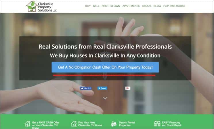
You do not want your button colors to blend into the background or overall color scheme of the website. Having contrasting button colors will help to bring your visitor's eyes to your CTA.
Objection this element overcomes:
- Can I easily find what I'm looking for?
8. Custom Button Text
Your button text should speak to the end result and compliment your CTA.
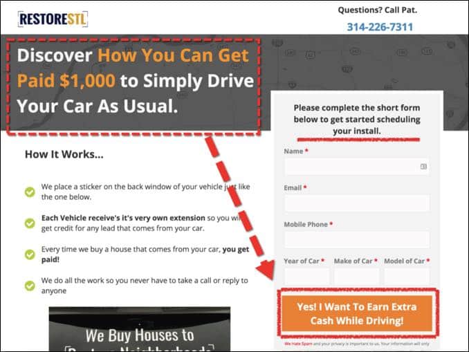
You can see below, the offer is to get paid $1,000 to drive as usual, and the button supports that end result.
Objections this element overcomes:
- Can you solve my unique problem?
9. Social Proof
Please understand that testimonials only help to increase credibility, but it’s not a complete deal breaker. Do not let this stop you. Every investor had to close their first deal at some point. Just be sure you’re collecting testimonials as you go.
Leverage testimonials to build credibility and trust. Your prospects want to know that the service you offer is legitimate and actually works. You can see below that there are actual drivers getting paid money using this program.
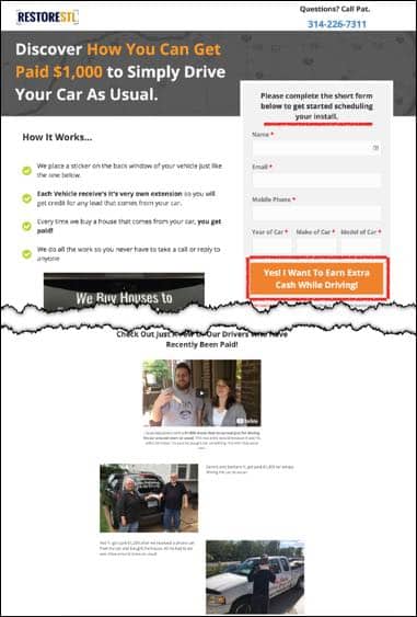
In the case of talking to distressed sellers, a prospect visiting your website wants to know that your solution works for their unique needs, and that you have helped people like them before.
Objections this element overcomes:
- Can you solve my unique problem?
- Can you be trusted?
Proof Icons
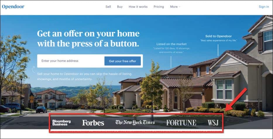
If you have had any media appearances, or have written articles in any local or national publications, be sure to include those on your website. This is a great way to differentiate yourself from the competition in your market.
Objections this element overcomes:
- Can you be trusted?
10. Use Visual Cues
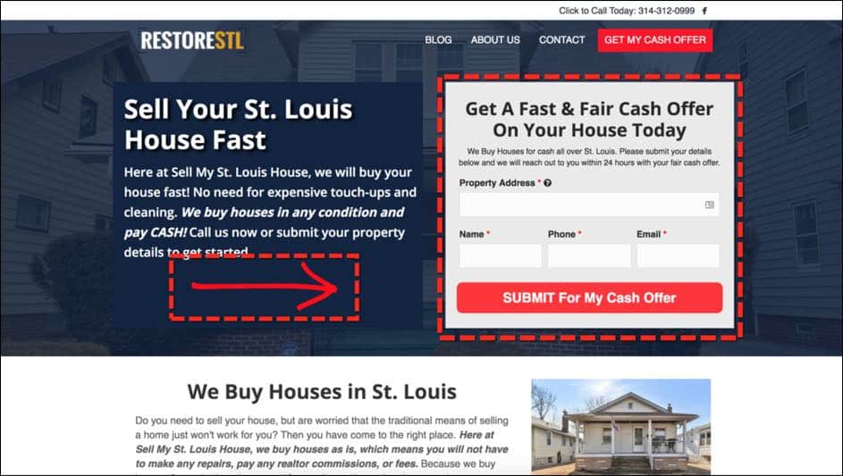
Use arrows and boxes around your CTA’s and webforms to dictate where the visitor should focus their attention. See the image below for an example.
Objections this element overcomes:
- Can you solve my unique problem?
11. Limit Form Fields
Only ask for the information you absolutely need. If you have the address you can find the bedroom and bathroom count.
If there are any other questions you have, you can call or email the prospect.
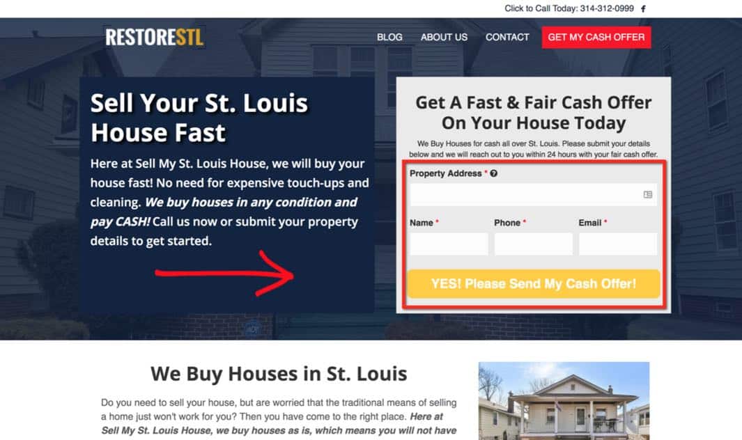
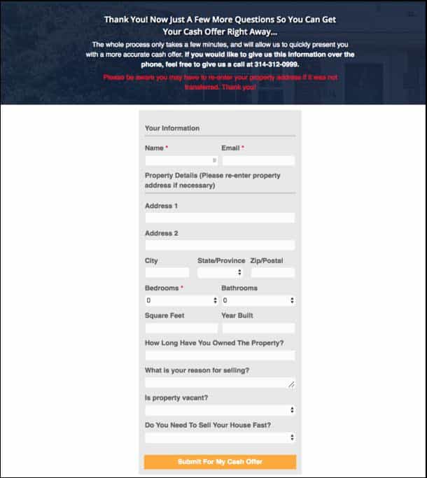
BONUS POINTS: You can always ask for more information on your Thank You Page. Scroll to the next page to see an example of a Thank You Page that asks for more information.
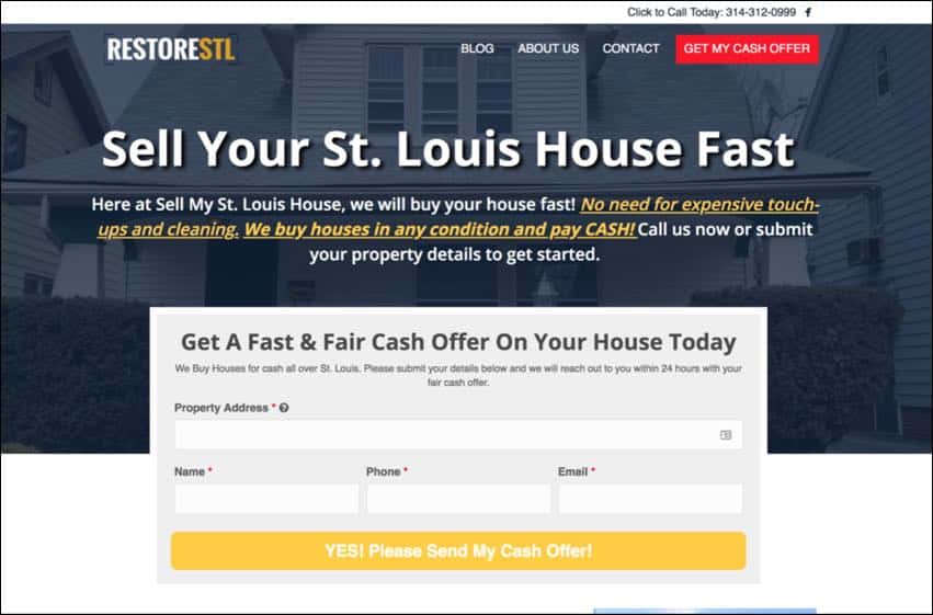
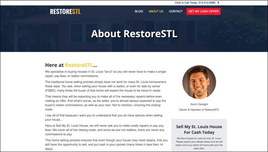
12. Be Consistent
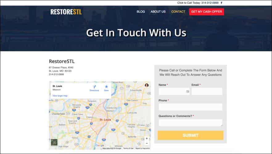
You want to make sure that your website is consistent.
Keep all of your call-to-action Buttons and webform buttons the same color.
Use consistent fonts for your headings, and body text throughout the entire website.
You can see in the screenshots below, that this website has a consistent theme across each and every page.
This is important and helps create a website that is easy to navigate and allows your visitors to find what they are looking for without trouble.
Objection this element overcomes:
- Can I easily find what I'm looking for?
Bringing it all together…
When building your website, include as many of these elements as possible, and you will see your conversions dramatically increase.
Again, I want to stress that you should not let any of these elements hold you back from getting started. If you don’t have testimonials, for example, you can still create a great website.
Like they say, “Done is better than perfect!” Now get started building your website today.
If you want to learn more about how REI BlackBook can help you build a real estate investing website book a demo call with one of our team members today!
What You Should Do Now:
- Get started with REI Blackbook for FREE: Get 14 days FREE access to our software and start converting more leads into deals.
- If you'd like to learn the exact strategies our power users are implementing to generate motivated seller leads consistently, check out our Motivated Seller Guide.
- If you'd like to learn how our team can build out your REI Blackbook system FOR you, head to our implementation page.
- If you know another real estate investor who'd enjoy reading this page, share it with them via email, Linkedin, Twitter or Facebook.
Unlock the System Top Investors Swear By—Take Back Your Life with a 14-Day Free Trial
Automate Your Business. Close More Deals. Enjoy More Freedom.
- Automate Everything – Put your business on autopilot, from lead follow-up to closing.
- Close More Deals – Use AI tools to quickly spot and lock in the best opportunities.
- Reduce Stress – Streamline your workflow so nothing falls through the cracks.
No long-term commitments. Cancel Anytime


